BriteQuote
Quote Flows
Quote Flow is a flexible solution to create custom Quoting wizards without touching a single line of code.
A Quote Flow is a configurable file defining a series of steps, fields to display in each step, the order we want the fields to appear in, how we want the fields to look, and even to define custom actions for each step.
Each Quote Flow is rendered as a wizard by the frontend, in which users can quickly fill in customers’ data and quickly get a quote for them.
If you want to jump straight to the tutorial on how to create a Quote Flow, click here.
Summary
- Quote Flow Concepts
- Defining a Custom Flow
- Quote Flow Search Criteria
- The YAML Format
- Loading a Quote Flow
- The YAML editor
Concepts
Quote Flow defines a set of building blocks to be used together in the configuration file in order to compose a quoting wizard:
- Page Group
- Pages
- Header Toolbar
- Footer Toolbar
- Sidebar
- Risk Edit
- Grouped Risk Edit
- Data Field Group
- Data Field
- Tooltips
- Widgets
- Plugin Slot
- Risk List
- Risk Table
- Nested Risk Table
- Multi Risk Edit
- Risk Item Group
- Risk Item
- Block
- Separator
- Rate Quote Button
- Submit Quote Button
- Bind Quote Button
- Request Document Button
- Email Document Button
- Continue Button
- Back Button
- Total Premium Display
- Attachment Upload Panel
- Associate Contacts Panel
- Row
- Discard Endorsement Button
- Review Panel
- Payment Plans Display
- Billing Panel
- Conversion Policy Number Input
- Save Risk Button
- Remove Risk Button
At this moment, Quote Flows can be defined via YAML files using the concepts listed above. Check out this section for more information on YAML.
Page Group
A Page Group is collection of pages that together make for a step in the Quoting Wizard.
Properties
name: a reference name for the page group.title: an optional title to be displayed on top of the page group.pages: a list of Page objects.
Example
version: '1.0'
pageGroups:
  - title: Setup
    name: setup
    pages:
      - title: Policy Setup
        name: policySetup
      - title: Additional Questions
        name: additionalQuestions
  - title: Drivers
    name: drivers
    pages:
      - title: Drivers
        name: setup
  - title: Vehicles
    name: vehicles
    pages:
      - title: Vehicles
        name: setup
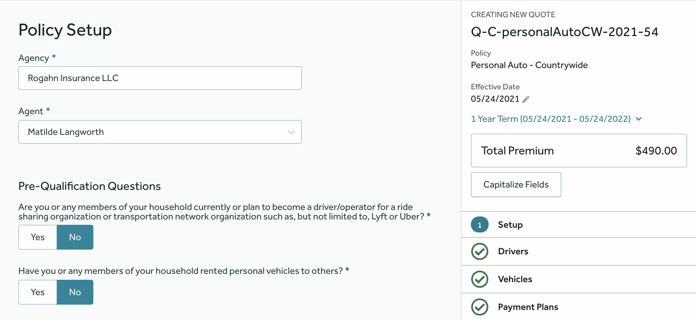
The YAML above represents a wizard consisting of three Page Groups, which are rendered as steps in the sidebar by the UI:
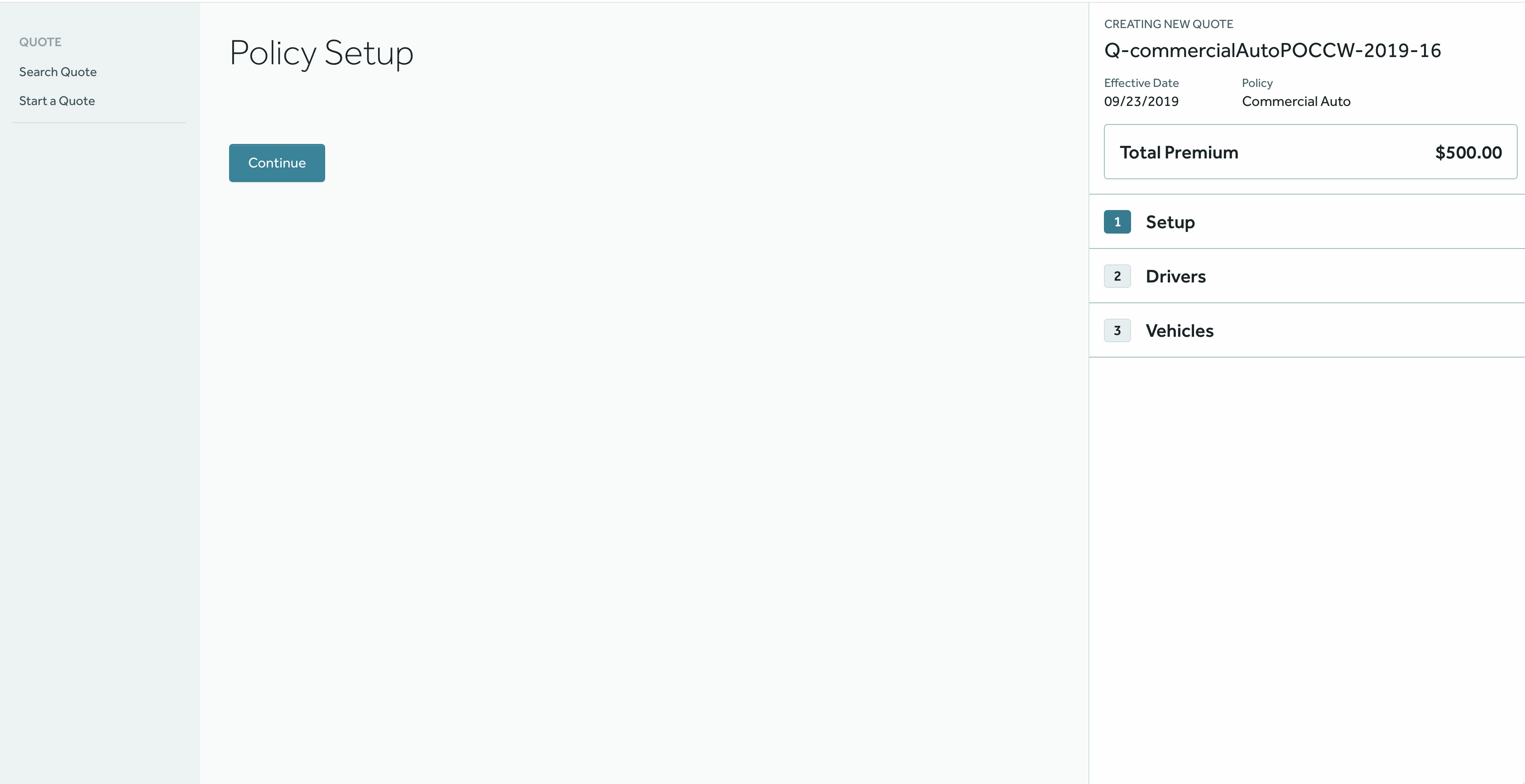
Page
A Page will be rendered as an inner step inside a Page Group, as the latter may contains several instances of the former. When clicking on the “Continue” button in the UI, the user will be redirected to the next Page from the current Page Group or to the next Page Group in case there aren’t more pages.
Properties
name: a reference name for the page.titlea title to be displayed on top of the page.continueButtonLabel: a human-readable label for the continue button.layout: a reference to a pre-built layout.components: a collection of components from the supported components list.headerToolbar: (Optional) a Header Toolbar component specific to this page.
Example
The YAML file from the Page Group section defines two different pages in its first Page Group, as you can see in the excerpt below:
pages:
  - title: Policy Setup
    name: policySetup
    continueButtonLabel: Continue to Additional Questions
    components:
      - type: totalPremiumDisplay
    headerToolbar:
      type: headerToolbar
      components:
        - type: pluginSlot
          slotName: britequote:policy-setup-header
          slotType: button-row
  - title: Additional Questions
    name: additionalQuestions
Supported components
Some Quote Flow components such as Page and Risk Table will render a list of components for user interaction, as defined in the YAML file. Right now, they supports rendering any of the components below:
- Risk Edit
- Grouped Risk Edit
- Risk List
- Risk Table
- Block
- Separator
- Submit Quote Button
- Bind Quote Button
- Total Premium Display
Header Toolbar
A Header Toolbar renders a toolbar at the top of every page in the Quote Flow. It can be placed in a specific page or globally in all pages.
Properties
type: a constant value that must be set toheaderToolbar.components: a list of generic components. At the moment, only the Plugin Slot component is supported.
Example
headerToolbar:
  type: headerToolbar
  components:
    - type: pluginSlot
      slotName: britequote:header
      slotType: button-row
pageGroups:
  - title: Drivers
    name: setup
    pages:
      - title: Drivers
        name: driverSetup
        headerToolbar:
          type: headerToolbar
          components:
            - type: pluginSlot
              slotName: britequote:drivers:header
              slotType: button-row
The above configuration will render the plugin slots in the Quote Flow header depending on where it is placed:
Footer Toolbar
A Footer Toolbar renders a sticky toolbar at the bottom of every page in the Quote Flow. It is placed as a top-level component in the Quote Flow.
It can be used to put any component in the footer. For example, Continue Button and Back Button for pagination.
Continue Button and Back Button will be added automatically in the left column if not defined in the Footer Toolbar Component.
Properties
type: a constant value that must be set tofooterToolbar.name: a reference name for this component.rows: a collection of Row components.
Example
footerToolbar:
  type: footerToolbar
  name: footerToolbar
  rows:
    - type: row
      name: paginationRow
      columns:
        - align: left
          name: continueButtonCol
          component:
            type: continueButton
        - align: left
          name: backButtonCol
          component:
            type: backButton
        - align: right
          name: textCol
          component:
            type: block
            text: Progress is being saved.
The above configuration will render the footer toolbar with the defined columns:
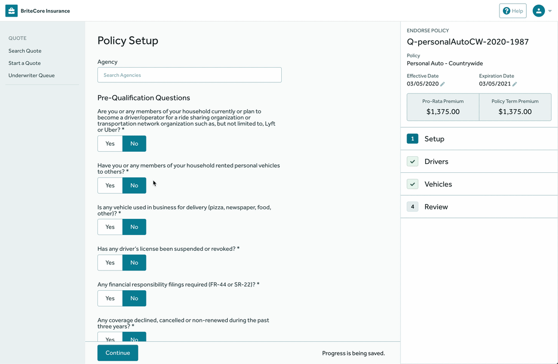
Sidebar
A Sidebar component can be used to render components in the Quote Flow sidebar. It is placed as a top-level component in the Quote Flow.
Properties
type: a constant value that must be set tosidebar.name: a reference name for this component.components: a list of generic components. At the moment, only the Plugin Slot component is supported.
Example
sidebar:
  type: sidebar
  name: sidebar
  components:
    - type: pluginSlot
      slotName: britequote:sidebar
      slotType: button-row
The above configuration will render the sidebar components in the Quote Flow sidebar:
Risk Edit
A Risk Edit renders a form containing several Data Field Groups used for editing a single Risk Type.
It is a generic YAML object, whose type attribute is set to riskEdit.
Properties
type: a constant value that must be set toriskEdit.riskType: the name of the Risk Type whose fields are going to be edited by this Risk Edit. It is the reference name on BriteLines for the Risk Type.fieldGroups: a collection of Data Field Groups.components: a collection of generic components. At the moment, only the Multi Risk Edit, Risk Item Group and Nested Risk Table components are supported.footerToolbar: (Optional) a custom Footer Toolbar for the risk being edited. Footer Toolbar is supported only when the Risk Edit component is defined in a Risk List or a Risk Table component. Footer Toolbar also supports Save Risk Button and Remove Risk Button components. If these buttons are not present in the config, they are added by default.
Footer Toolbar Example
type: riskEdit
riskType: drivers
fieldGroups:
- title: Personal Information
  name: Personal Info
  fields:
  - name: isNamedInsured
  - name: firstName
footerToolbar:
  type: footerToolbar
  name: footerToolbar
  rows:
  - type: row
    name: toolbarRow
    columns:
    - name: saveButtonCol
      align: right
      component:
        type: saveRiskButton
        label: Save Vehicle
    - name: removeButtonCol
      align: left
      component:
        type: removeRiskButton
        label: Vehicle
    - name: pluginSlotCol
      align: right
      component:
        type: pluginSlot
        slotName: britequote:footer
        slotType: button-row
The example in the next section shows an actual Risk Edit in action.
Data Field Group
A Data Field Group is a collection of Data Fields or nested Data Field Groups used to group a set of related fields together on the screen.
Data Field Groups are supposed to be children of Risk Edit components.
Properties
name: a name for the data field group.title: a title to show on top of the field group.displayType: (Optional) a reference to the visual component that we want to use to render this field group. If set toinline, the fields will be rendered inline when possible.fields: a collection of fields that will be rendered by this group.
Example
version: '1.0'
pageGroups:
  - title: Setup
    name: setup
    pages:
      - title: Policy Setup
        name: policySetup
        components:
          - type: riskEdit
            riskType: policy
            fieldGroups:
              - title: Named Insured
                name: Contact Information
                displayType: el-card
                fields:
                  - name: firstNameNI
                    label: First Name
                  - name: middleInitialNI
                    optional: true
Notice how the Contact Information data field group is nested under a
Risk Edit for editing an instance of the policy Risk Type.
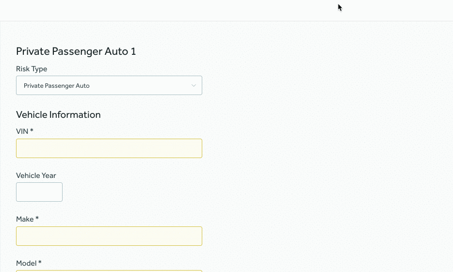
This is how the Risk Edit and Field Group above would be rendered by the UI:
Data Field
A Data Field is rendered by the UI as a label plus an input element to be used by the agent to input customer’s data into the system.
It has to be a reference to a data field already setup in BriteLines. For
example, to render a field to hold a drivers’s first name, we need to setup
a data field referencing the firstName data field from the Drivers
Risk Type.
Properties
name: the reference name of the Data Field that we want to place in the page (as defined on BriteLines).label: a label to override the default label setup in Lines for that Data Field.default: a default value to override any default values set on Lines for that Data Field.optional: a flag to make the field optional in the current page, even when it’s a required field on Lines.widget: a Widget object to customize the field’s appearance.helpText: text to provide additional context about a Field.tooltip: interactive icon to provide accessory text related to a Field.pluginSlot: a Plugin Slot object to render a plugin along with the field.
Example
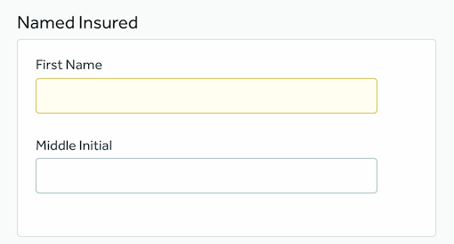
fields:
  - name: firstNameNI
    label: First Name
    helpText: As it appears on your birth certificate
  - name: middleInitialNI
    optional: true
    tooltip:
      text: Middle initials
The fields above will be rendered like this by the UI:
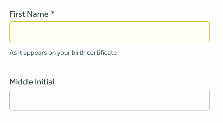
Tooltips
This component renders an interactive tooltip to optionally display extra information.
Properties
text: Custom text to be displayed when hovering over the tooltip icon.
Example
fields:
  - name: businessName
    label: Business Name
    tooltip:
      text: Tooltip text goes here
Widget
Widgets are nothing but properties that we can set on fields so that they have a custom appearance.
Properties
type: the type of widget we want to render. Check supported widgets for a list.size: a size for the widget. Supported values:tn,xs,sm,md,rg,lg,xlandfull.
Example
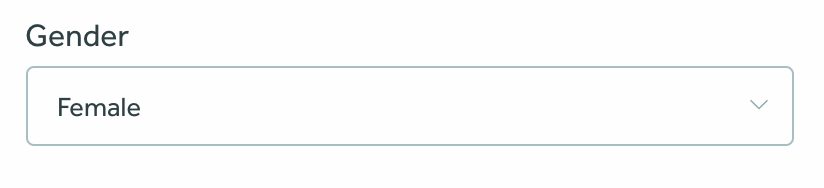
Consider this field:
fields:
  - name: gender
Without a widget, the gender field is going to be rendered as a select box,
as it is defined in BriteLines as an enum field. This is how it looks by
default:
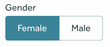
However, we can change the way it looks with a widget:
fields:
  - name: gender
    widget:
      type: button-selection
      size: lg
And now, it is going to be rendered as:
Supported widgets
Quote Flow supports these types of widgets at this moment:
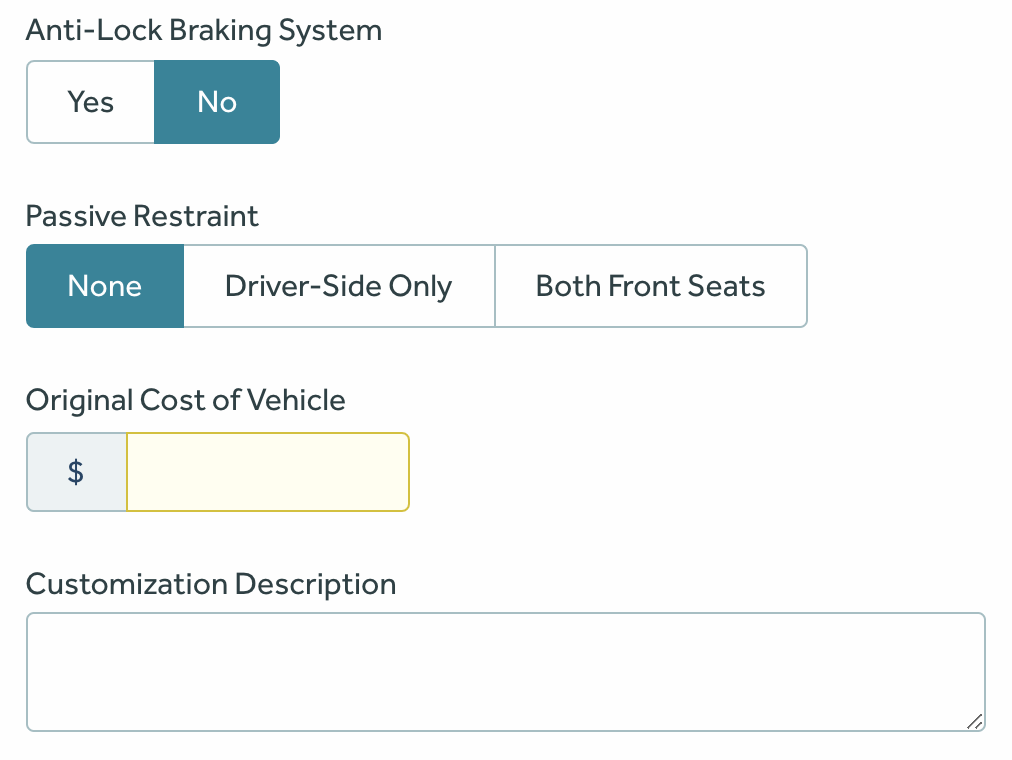
boolean-buttons: an alternative to the usual boolean checkboxes.button-selection: an alternative to select boxes that displays the options inline.currency: to render any currency value.textarea: for fields whose value is supposed to be a longer text.
Example:
fields:
  - name: hasAntiLock
    widget:
      type: boolean-buttons
  - name: passiveRestraint
    widget:
      type: button-selection
  - name: originalCost
    widget:
      type: currency
      size: sm
  - name: customizationDescription
    widget:
      type: textarea
The YAML above is rendered like this by the UI:
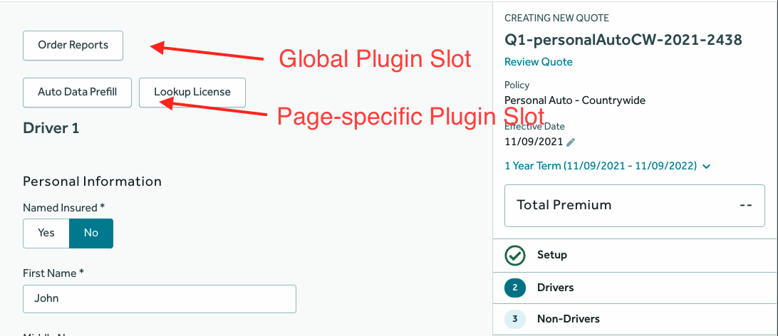
Plugin Slot
Plugin slot is an object containing properties that we can set on the fields to render a plugin along with the field.
Properties
slotName: the name of the plugin slot. Used to decide which plugin to render. For example,britequote:risk-edit.slotType: the name of the plugin slot type. Used to decide which type of plugin to render. For example,button-row.
Example
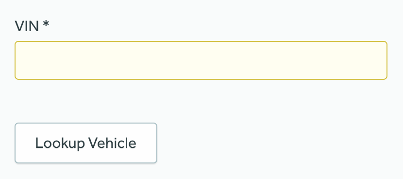
fields:
  - name: serialVin
    label: VIN
    pluginSlot:
      slotName: britequote:risk-edit
      slotType: button-row
The field above will be rendered like this by the UI:
Grouped Risk Edit
A Grouped Risk Edit renders a single RiskEdit form for multiple Risk Types. It renders a select option above the risk edit form for selecting the Risk Type.
This is useful when multiple Risk Types represent a single logical unit. For example, different Risk Types like Private Passenger Auto, Motor Homes, Golf Carts, etc. can be logically a Vehicle.
Properties
type: the component type, always set togroupedRiskEdit.name: a unique reference name for the risk edit group.label: a human readable label which represents the logical unit. e.g. Vehicle.riskEdits: a list of RiskEdit components which are supposed to be grouped together.
Example
type: groupedRiskEdit
name: vehicleEditGroup
label: Vehicle
riskEdits:
  - type: riskEdit
    riskType: privatePassengerAutos
    fieldGroups:
      - title: Vehicle Information
        name: Vehicle Info
        fields:
          - name: serialVin
            label: VIN
          - name: modelYear
            widget:
              size: xs
          - name: make
          - name: model
  - type: riskEdit
    riskType: golfCarts
    fieldGroups:
      - title: Vehicle Information
        name: Vehicle Info
        fields:
          - name: serialVin
            label: Serial/VIN
          - name: modelYear
            widget:
              size: xs
          - name: make
          - name: model
  - type: riskEdit
    riskType: motorHomes
    fieldGroups:
      - title: Vehicle Information
        name: Vehicle Info
        fields:
          - name: serialVin
            label: Serial/VIN
          - name: modelYear
            widget:
              size: xs
          - name: make
          - name: model
Then YAML above is rendered like this by the UI:
The Risk Type selection option will be disabled when editing an existing risk.
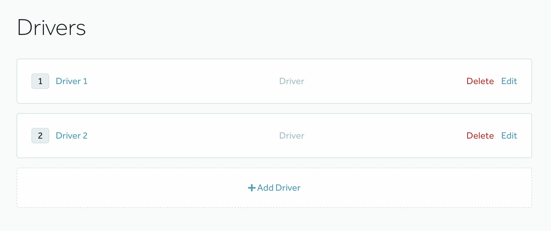
Risk List
A Risk List renders a list of cards, each card representing a Risk. It also renders an empty card with a button to add new Risks.
Properties
type: the component type, always set toriskList.name: a reference name for the risk list.riskTypes: a list of reference name of the Risk Type whose risks should be displayed in the list.riskLabel: a human readable label for the Risk Type that will be used to represent the Risk Type on the page.addNewRiskLabel: a human readable label for the button that will be displayed to add a new Risk.indicators: a conditional information to be displayed for each risk on the list to indicate the current state of that risk to the user, replacing theriskLabelon the list, Limited to one per Risk List. More in Indicators.suffixes: a conditional information to be displayed with the risk identifier, providing more information about the risk in the list. More in Suffixes.components: a list of risk editing components to be rendered on the add or edit page. Currently, RiskEdit and GroupedRiskEdit can be used for editing risks.
Example
- type: riskList
  name: driverList
  riskTypes:
    - drivers
  riskLabel: Driver
  addNewRiskLabel: Add Driver
  indicators:
    - name: securityFreezeIndicator
      field: securityFreezeDriver
      display:
        when: true
        icon: lock
        label: Security Freeze
  components:
    - type: riskEdit
      riskType: drivers
      fieldGroups:
        - name: Personal Information
          fields:
            - name: driverName
            - name: gender
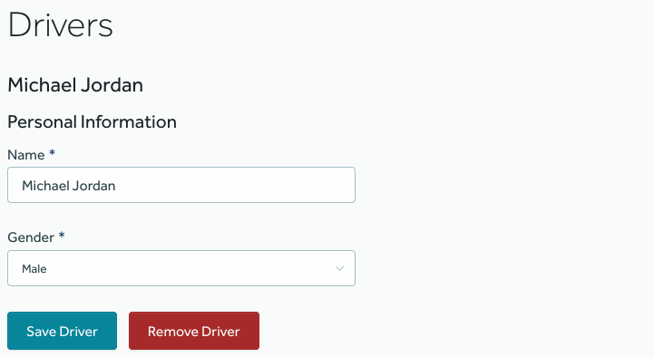
The YAML above would render a list of editable cards like this:
In addition to that, when the user clicks on “Add Driver”, a page like this will open where the user will be able to add a driver:
Example with multiple Risk Types
- type: riskList
  name: vehcileList
  riskTypes:
    - privatePassengerAutos
    - golfCarts
    - motorHomes
  riskLabel: Vehicle
  components:
    - type: groupedRiskEdit
      name: vehicleEditGroup
      label: Vehicle
      riskEdits:
        - type: riskEdit
          riskType: privatePassengerAutos
          fieldGroups:
            - title: Vehicle Information
              name: Vehicle Info
              fields:
                - name: serialVin
                  label: VIN
        - type: riskEdit
          riskType: golfCarts
          fieldGroups:
            - title: Vehicle Information
              name: Vehicle Info
              fields:
                - name: serialVin
                  label: Serial/VIN
        - type: riskEdit
          riskType: motorHomes
          fieldGroups:
            - title: Vehicle Information
              name: Vehicle Info
              fields:
                - name: serialVin
                  label: Serial/VIN
The YAML above would render a list of editable cards of different risk types like this:
In addition to that, when the user clicks on “Add Vehicle”, a page like this will open where the user will be able to add a Vehicle.
Indicators
An Indicator displays a label and optionally an icon when a certain condition on the risk is met.
Properties
name: the reference name for the indicator.field: reference name of the field to be used for condition evaluation.display: (Optional) defines the condition and the value to be displayed on the indicator, if not defined the default values will be used.when: (Optional) a value that the field will be compared to. If the comparison is true, then the indicator will be rendered, otherwise not. If not available, it will always be displayed.icon: (Optional) an icon to prefix the indicator, the supported values are based on the icons from the FontAwesome project available on BriteCore Design System, if not present just the label will be shown.label: (Optional) a human readable label that will be displayed when the condition is met, if not present the value of the field will be used.
Example with Indicators
- type: riskList
  name: driverList
  riskTypes:
    - drivers
  riskLabel: Driver
  indicators:
    - name: securityFreezeIndicator
      field: securityFreezeDriver
      display:
        when: true
        icon: lock
        label: Security Freeze
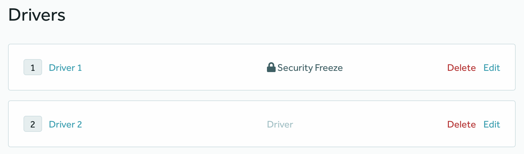
The YAML above would be rendered like this by the UI, where one Driver has the securityFreezeDriver defined, and the
other doesn’t:
Suffixes
A Suffix displays extra information on the risk identifier when a certain condition on the risk is met.
Properties
name: the reference name for the suffix.field: reference name of the field to be used for condition evaluation.display: (Optional) defines the condition and the value to be displayed on the suffix, if not defined the default values will be used.when: (Optional) a value that the field will be compared to. If the comparison is true, then the suffix will be rendered, otherwise not. If not available, it will always be displayed.label: (Optional) a human readable label that will be displayed when the condition is met, if not present the value of the field will be used.
Example with Suffixes
- type: riskList
  name: driverList
  riskTypes:
    - drivers
  riskLabel: Driver
  suffixes:
    - name: driverRiskNameSuffix
      field: deceased
      display:
        when: true
        label: "(Deceased)"
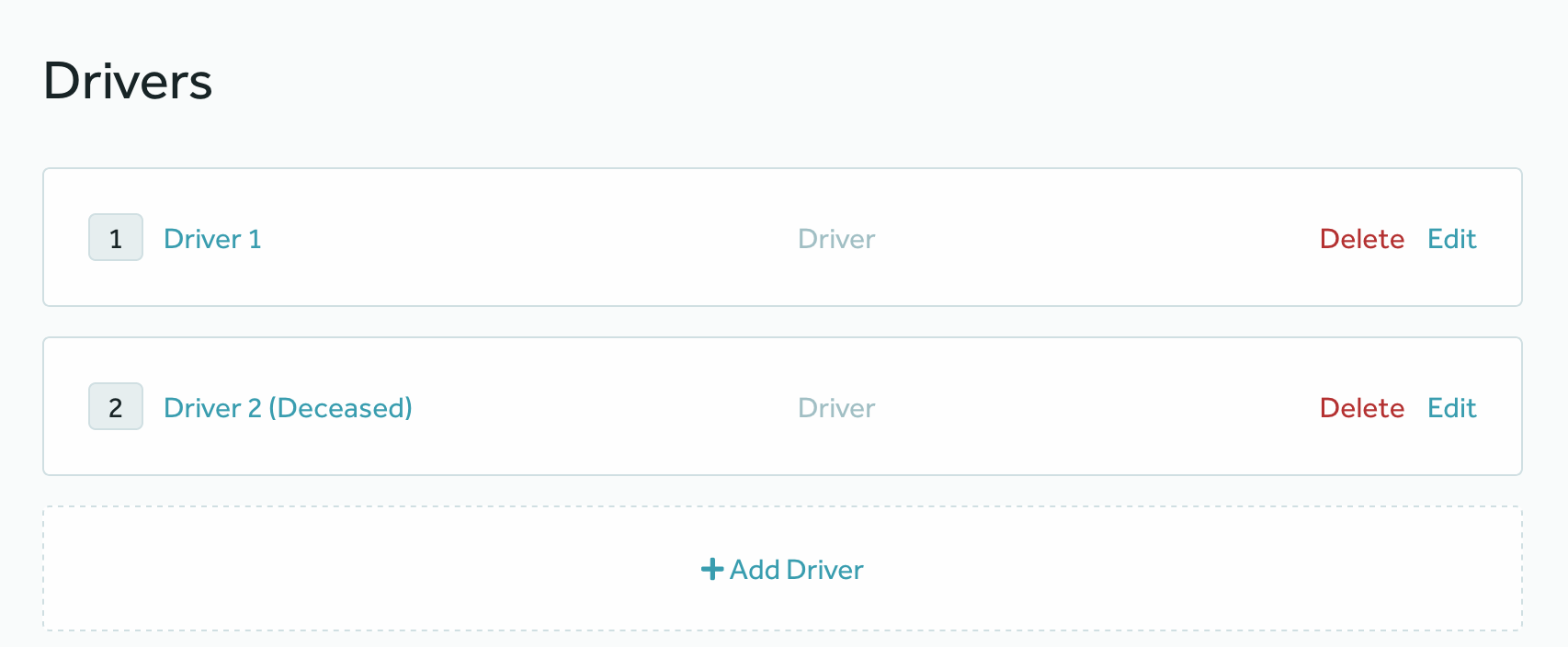
The YAML above would be rendered like this by the UI, where one Driver has the deceased defined, and the
other doesn’t:
Risk Table
A Risk Table is rendered by the UI as a table of Risks of a given type and, optionally, a button to add a new Risk using a popup modal.
It is a generic YAML object, whose type attribute is set to riskTable.
Properties
type: the component type, always set asriskTable.name: a reference name for the risk table.riskTypes: a list of Risk Types whose risks should be displayed in the list.riskLabel: a human readable label for the Risk Type that will be displayed in the list.columns: a list to define which fields from the risks will be rendered in the table.name: the field name, as in Lines.header: a human-readable value for the column header.
actions: a list of actions.
Example
- type: riskTable
  name: vehicleTable
  columns:
    - name: make
      header: Make
    - name: model
      header: Model
    - name: modelYear
      header: Year
  riskTypes:
    - vehicles
  riskLabel: Vehicle
  actions:
    - trigger: rowClick
      type: modal
      components:
        - type: riskEdit
          riskType: vehicles
          fieldGroups:
            - title: Vehicle Information
              name: Vehicle Info
              displayType: el-card
              fields:
                - name: vin
                - name: make
    - trigger: addNewClick
      type: modal
      components:
        - type: riskEdit
          riskType: vehicles
          fieldGroups:
            - title: Vehicle Information
              name: Vehicle Info
              displayType: el-card
              fields:
                - name: vin
                - name: make
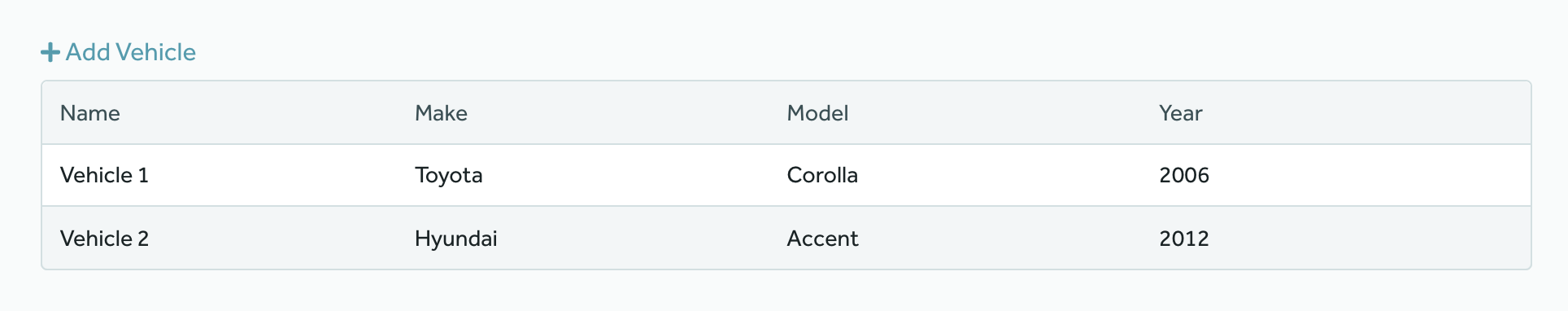
The YAML above would render the following Risk Table:
In addition to that, when the user clicks on “Add Vehicle”, a page will show to allow for the user to add a new Vehicle.
Special Properties
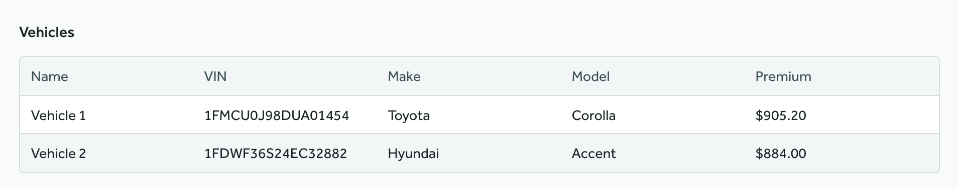
The columns property can contain a special optional column named __premium__ which will display each risk’s total premium in the list if included.
- type: riskTable
  name: vehicleTableReview
  riskTypes:
    - vehicles
  title: Vehicles
  columns:
    - name: vin
      header: VIN
    - name: make
      header: Make
    - name: model
      header: Model
    - name: __premium__
      header: Premium
Risk Table Action
A Risk Table Action represents a configurable action that can be triggered when a given event happens on a Risk Table.
Even though they are pretty much configurable from the YAML standpoint, it is worth noticing that new triggers and action types will probably require code changes in the UI component that will handle them.
Properties
trigger: the event this action is going to react to. This is nottype: the kind of action you want to happen in the UI.components: a list of components to be rendered.
Example
- trigger: rowClick
  type: showModal
  components:
    - type: riskEdit
      riskType: drivers
      fieldGroups:
        - title: Personal Information
          name: Personal Info
          fields:
            - name: firstName
            - name: gender
When the action above is triggered, a page like this is going to show up on the screen:
Nested Risk Table
The Nested Risk Table component is in charge of handling children risk quotes for a Risk Edit.
Let’s say that we need our Quoting wizard to handle the following risk hierarchy:
Policy
  - Drivers
    - Violations
That is, for each driver in our policy we want to be able to add multiple violations.
In this case, all we have to do is to add a Risk Edit for the driver and nest a Nested Risk Table for the driver violations on it.
Properties
type: the component type, always set asnestedRiskTable.name: a reference name for the Nested Risk Table component.title: (Optional) a human readable title for the Nested Risk Table component.riskTypes: a list of reference names of the Risk Type whose risks should be displayed in the table. For now, a single one is supported.columns: a list of table columns to be rendered.header: a human readable value for the column header.field: the field name, as in Lines or a risk field name prefixed byrisk.. Required when columntypeis notaction.type: (Optional) the column type, possible value isaction.width: (Optional) the column width in percentage.tooltip: (Optional) interactive icon to provide accessory text related to column.
dialog: an object containing the configuration for the dialog that appears when the user clicks on the add/edit risk button.title: (Optional) a title to be displayed on top of the dialog.components: a collection of components from the supported components list. Currently, only the RiskEdit component is supported.
Example
- type: riskEdit
riskType: drivers
fieldGroups:
- title: Personal Information
name: Personal Info
fields:
- name: firstName
label: First Name
- name: lastName
label: Last Name
components:
- type: nestedRiskTable
name: violationsRiskTable
riskTypes:
- violations
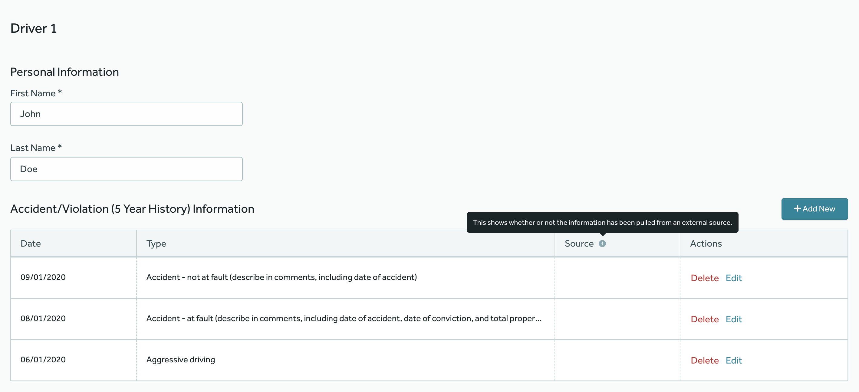
title: Accident/Violation (5 Year History) Information
columns:
- header: Date
field: violationDate
width: 15%
- header: Type
field: violationType
- header: Source
field: risk.generated_by
width: 15%
tooltip:
text: This shows whether or not the information has been pulled from an external source.
- header: Actions
type: action
width: 20%
dialog:
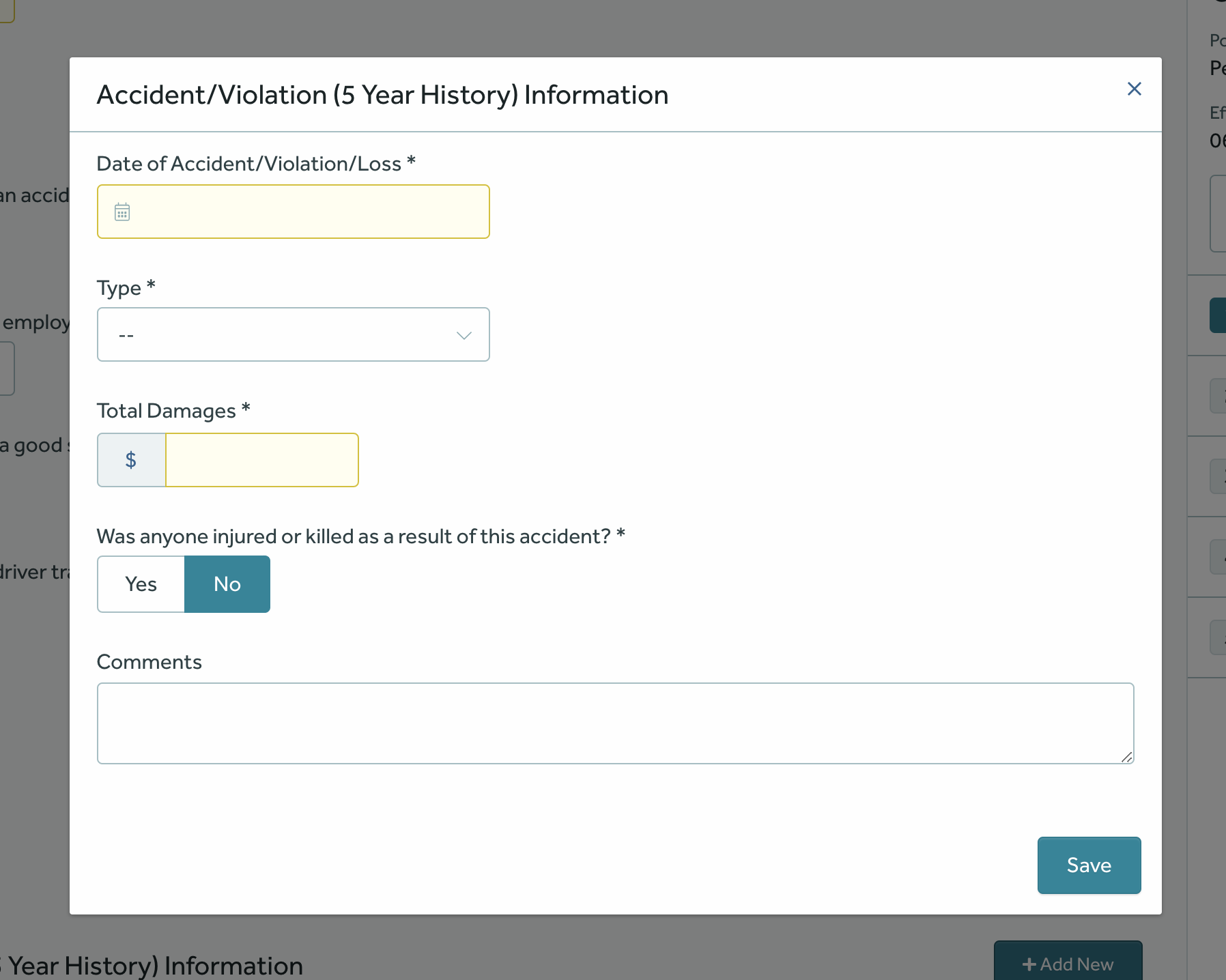
title: Accident/Violation (5 Year History) Information
components:
- type: riskEdit
riskType: violations
fieldGroups:
- name: Violations
fields:
- name: violationDate
widget:
size: md
- name: violationType
widget:
size: md
- name: violationTotalDamages
widget:
type: currency
size: sm
- name: violationBodilyInjury
label: Was anyone injured or killed as a result of this accident?
- name: violationInformation
widget:
type: textarea
size: full
The YAML above would be rendered like this by the UI:
The dialog would be rendered like this by the UI:
Multi Risk Edit
The Multi Risk Edit component is in charge of handling children risk quotes for a Risk Edit.
Let’s say that we need our Quoting wizard to handle the following risk hierarchy:
Policy
  - Drivers
    - Violations
That is, for each driver in our policy we want to be able to add multiple violations.
In this case, all we have to do is to add a Risk Edit for the driver and nest a Multi Risk Edit for the driver violations on it.
Properties
type: the component type, always set asmultiRiskEdit.riskType: the name of the Risk Type whose fields are going to be edited by this Risk Edit. It is the reference name on BriteLines for the Risk Type.headerText: a human readable label for the header of this component.addButtonLabel: a human readable label for the add button.fieldGroups: a collection of Data Field Groups.
Example
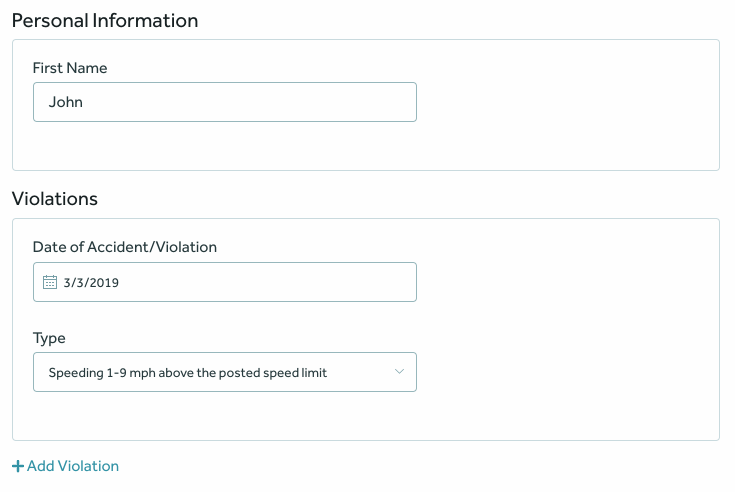
- type: riskEdit
  riskType: drivers
  fieldGroups:
    - title: Personal Information
      name: Personal Info
      displayType: el-card
      fields:
        - name: firstName
          label: First Name
  components:
    - type: multiRiskEdit
      riskType: violations
      headerText: Violations
      addButtonLabel: Add Violation
      fieldGroups:
        - name: Past Violations
          fields:
            - name: violationDate
            - name: violationType
The YAML above would be rendered like this by the UI:
Risk Item Group
The Risk Item Group is a collection of Risk Items used to group a set of related Risk Items on screen.
Risk Item Groups are supposed to be children of RiskEdit components.
Properties
type: the component type, always set asitemGroup.label: a human readable label for the header of this component.riskItems: a collection of risk items that will be rendered by this group.
Example
- type: riskEdit
riskType: privatePassengerAutos
fieldGroups:
- name: Vehicle Info
fields:
- name: serialVin
components:
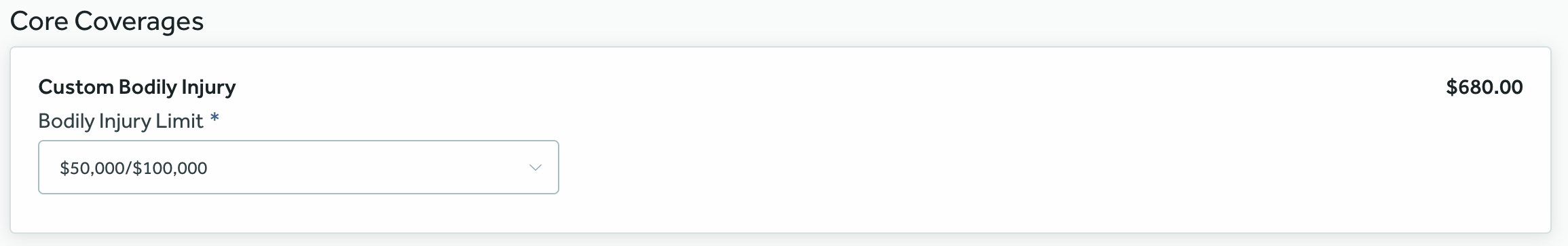
- type: riskItemGroup
label: Core Coverages
riskItems:
- name: bodilyInjury
label: Custom Bodily Injury
fields:
- name: bodilyInjuryLimit
The YAML above would be rendered like this by the UI:
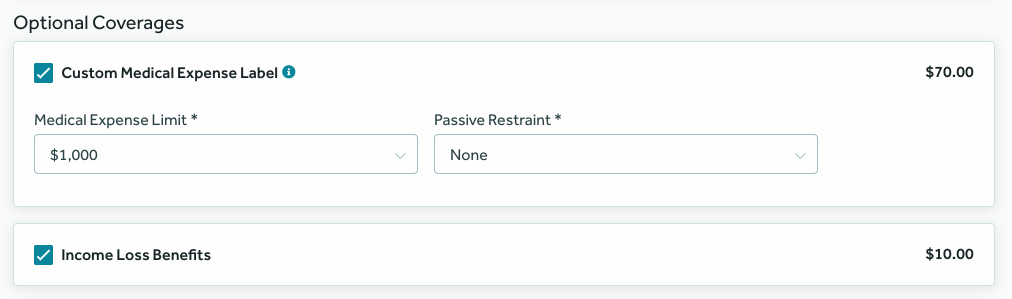
Risk Item
The Risk Item component is used to display a Risk Item for a Risk Item Group.
For example when we want the wizard to show items such as Medical Expense Coverage or Comprehensive Coverage.
Properties
name: the Risk Item’s reference name, as defined on BriteLines.label: a human readable label for the Item.tooltip: interactive icon to provide accessory text related to a Risk Item.displayType: (Optional) the style used to render the fields on this item. Allowed value:inline. When present and set toinline, the fields will be rendered inline whenever they fit.fields: a collection of fields that will be rendered by this Item.
Example
- type: riskItemGroup
  label: Optional Coverages
  riskItems:
    - name: medicalExpense
      displayType: inline
      label: Custom Medical Expense Label
      tooltip:
        text: Optional coverage for certain medical expenses
      fields:
        - name: medicalExpenseLimit
        - name: passiveRestraint
    - name: incomeLossBenefits
The YAML above would be rendered like this by the UI:
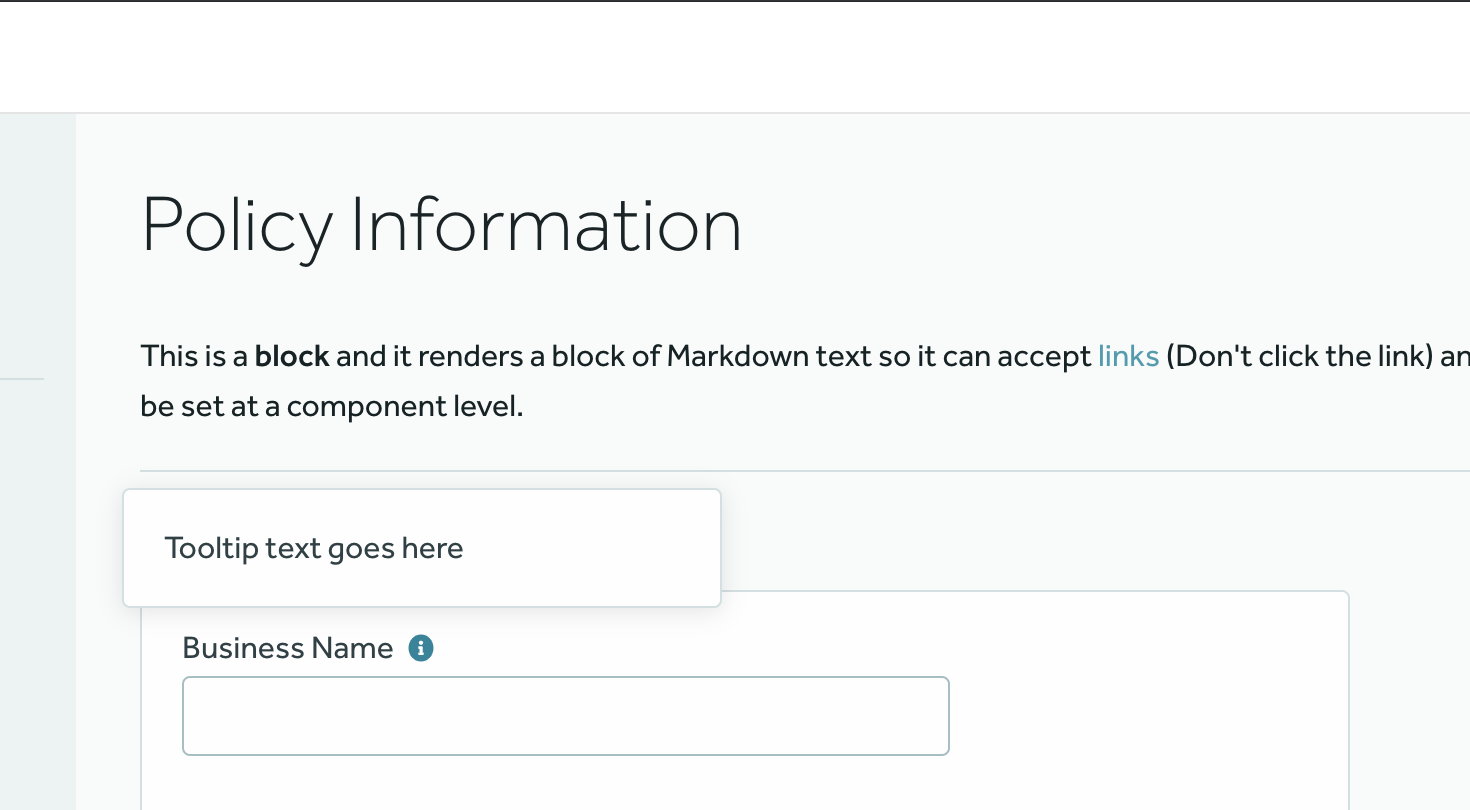
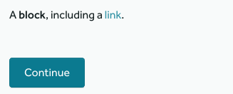
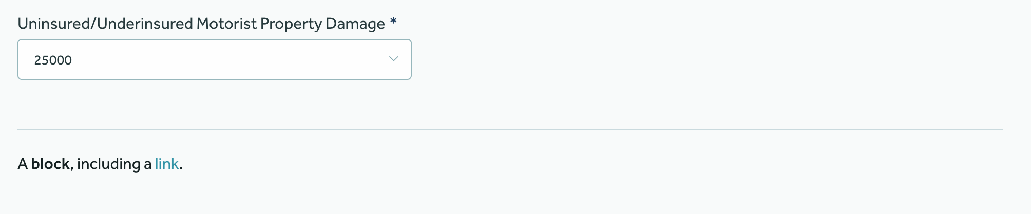
Block
The Block component renders an arbitrary block of Markdown text as HTML on a page. It may be useful for displaying extra information about the Quoting process to the agents.
Properties
type: the component type, always set asblock.text: the markdown text to be rendered as HTML on a page.
Example
components:
  - type: block
    text: A **block**, including a [link](http://foobar.com/).
The YAML above would be rendered like this by the UI:
Separator
The Separator component renders a visual horizontal separator on the page.
Properties
type: the component type, always set asseparator.
Example
components:
  - type: separator
The YAML above would be rendered like this by the UI:
Rate Quote Button
The Rate Quote Button component is a simple component which renders an action button that is responsible for rating a Quote.
It is a generic YAML object, whose type attribute is set to rateQuoteButton.
Properties
type: the component type, always set asrateQuoteButton.label: a label for the button.
Example
components:
  - type: rateQuoteButton
    label: Rate Quote
The YAML above would be rendered like this by the UI:

Submit Quote Button
The Submit Quote Button component is a simple component which renders an action button that is responsible for submitting a Quote to BriteRules for STP Review (Straight Through Processing).
It is a generic YAML object, whose type attribute is set to submitQuoteButton.
Properties
type: the component type, always set assubmitQuoteButton.label: a label for the button.
Example
components:
  - type: submitQuoteButton
    label: Submit Quote
The YAML above would be rendered like this by the UI:
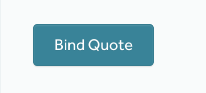
Bind Quote Button
The Bind Quote Button component renders an action button that allows the user to bind a quote when clicking on it. If a quote is bound, the Bind Quote Button is replaced with a Go to Policy button that when clicked takes the user to the policy associated with the quote.
Properties
type: the component type, always set asbindQuoteButton.label: a label for the button.style: (Optional) a style for the button. A list of supported style types can be found in UI Button Component
Example
components:
  - type: bindQuoteButton
    label: Bind Quote
Request Document Button
The Request Document Button component renders an action button that allows the user to request a Document from BriteDocs. The kind of document that will be generated is configurable via the documentName property.
Properties
type: the component type, always set asrequestDocumentButton.name: a reference name for the Request Document Button component.label: a label for the button.documentName: BriteDocs document type slug.style: (Optional) a style for the button. A list of supported style types can be found in UI Button ComponentrateRequired: (Optional) if it is set to true, the quote will be rated prior to generating the document.
components:
  - type: requestDocumentButton
    name: requestConfirmationOfCancellation
    label: Request Document
    documentName: document-type-slug
    rateRequired: false

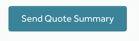
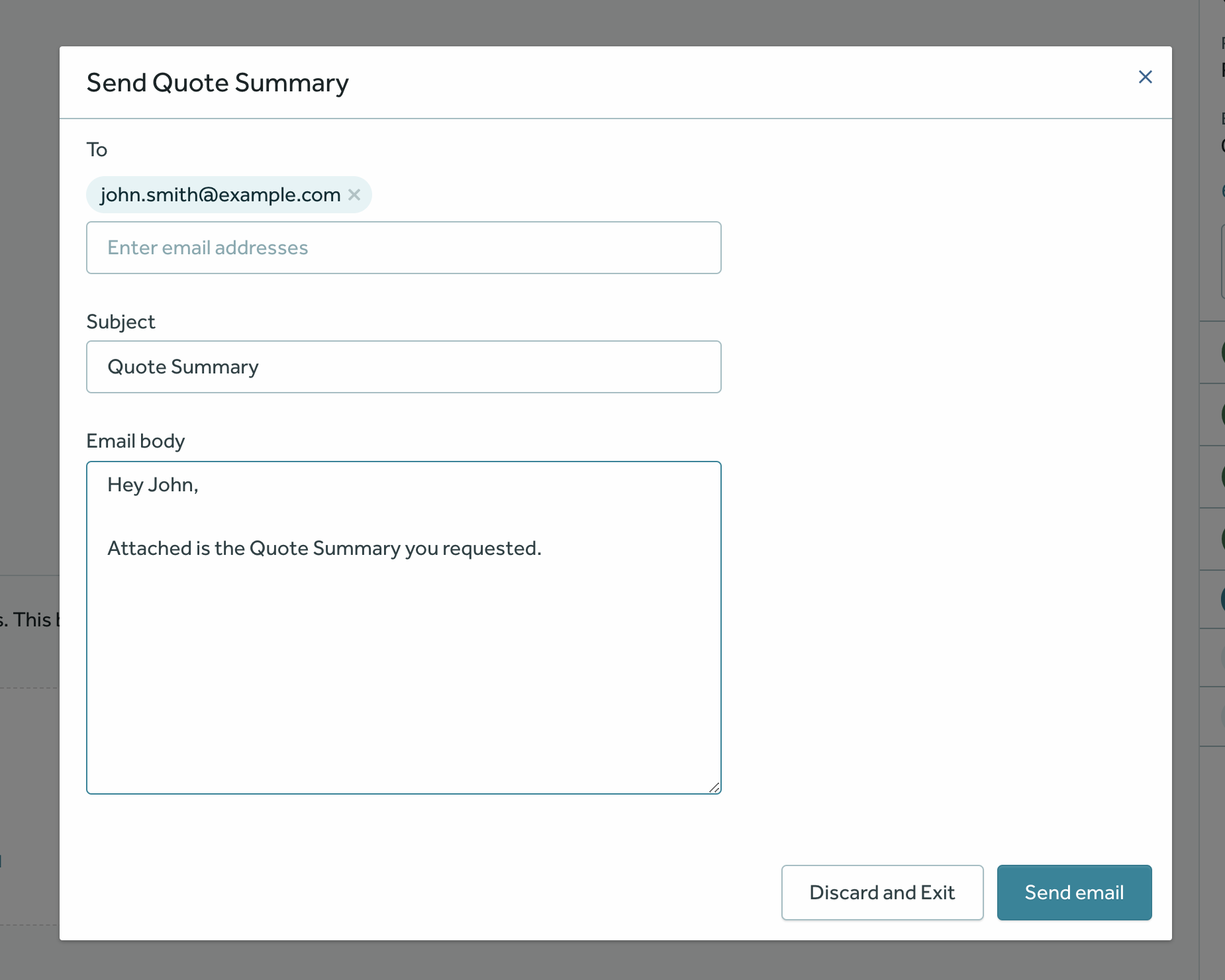
Email Document Button
The Email Document Button component renders an action button that allows the user to email a Document from BriteDocs. The kind of document that will be generated is configurable via the documentName property.
Upon clicking the button, a dialog is displayed that contains a form to fill the Recipient’s Email addresses, Subject and Body.
Properties
type: the component type, always set asemailDocumentButton.name: a reference name for the Email Document Button component.label: a label for the button.documentName: BriteDocs document type slug.style: (Optional) a style for the button. A list of supported style types can be found in UI Button ComponentrateRequired: (Optional) if it is set to true, the quote will be rated prior to generating the document.
components:
  - type: emailDocumentButton
    name: emailConfirmationOfCancellation
    label: Email Document
    documentName: document-type-slug
    rateRequired: false
Upon clicking the button, the email composition dialog is displayed.
Continue Button
The Continue Button component renders a button that should take the user to the next step in the quoteflow.
Properties
type: the component type, always set ascontinueButton.label: (Optional) a label for the button.
components:
  - type: continueButton
    label: Continue to Drivers

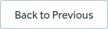
Back Button
The Back Button component renders a button that should take the user one step back in the quoteflow.
Properties
type: the component type, always set asbackButton.label: (Optional) a label for the button.
components:
  - type: backButton
    label: Back to Previous
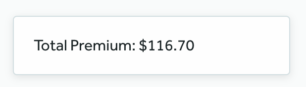
Total Premium Display
This is a very simple component which basically renders the value for the current quote’s total premium.
It is a generic YAML object, whose type attribute is set to totalPremiumDisplay.
Properties
type: the component type, always set astotalPremiumDisplay.
Example
components:
  - type: totalPremiumDisplay
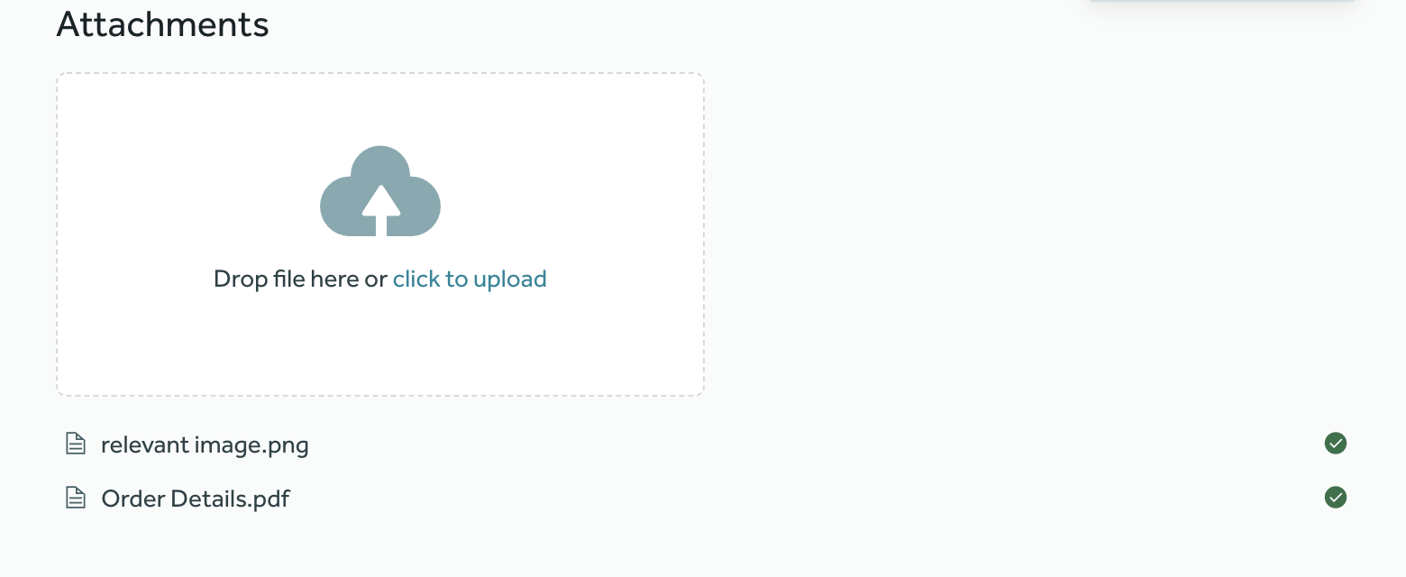
Attachment Upload Panel
This component allows uploading files to a quote and listing the files already uploaded.
Properties
type: the component type, always set asattachmentUploadPanel.name: a reference name for the attachment upload component.title: a human readable title for the Attachment Upload Panel.
components:
  - type: attachmentUploadPanel
    name: attachments
    title: Attachments
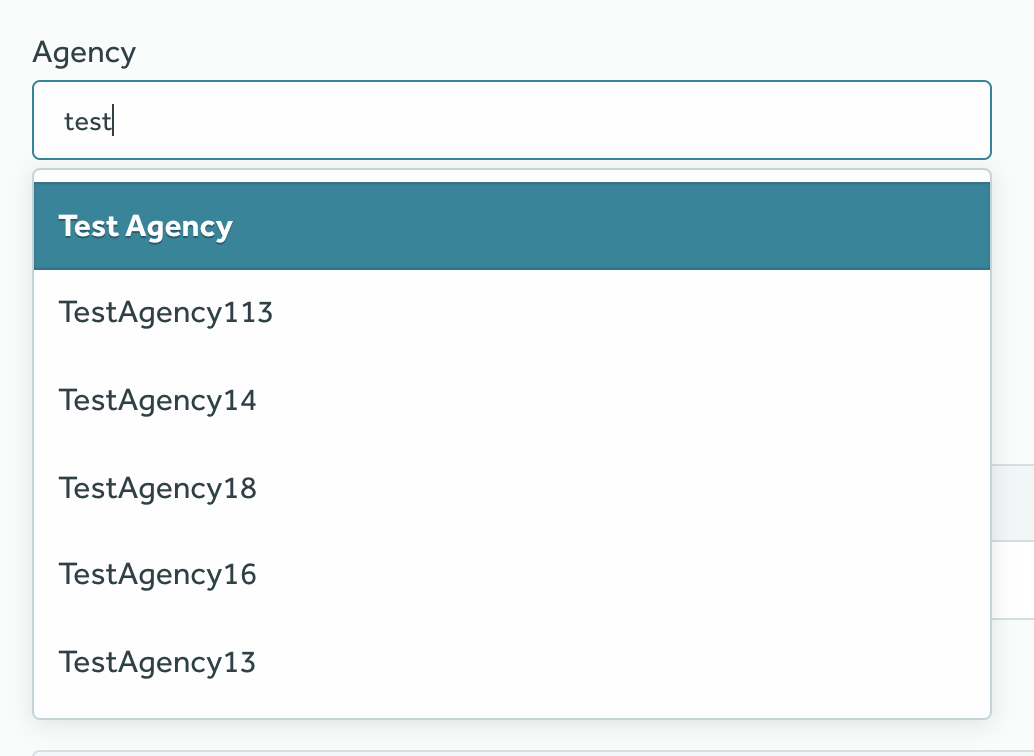
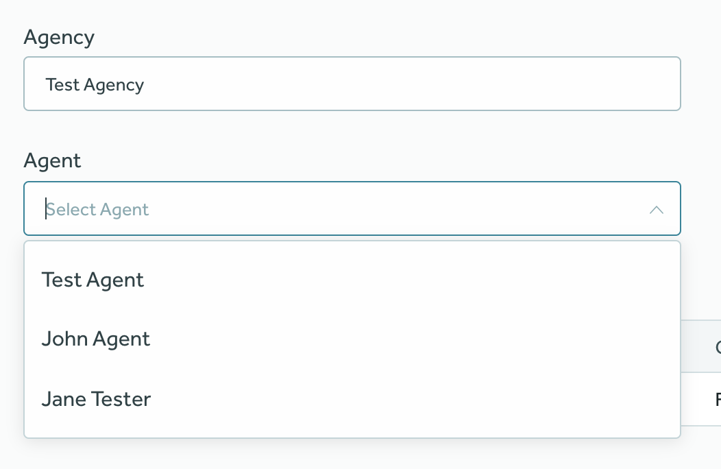
Associate Contacts Panel
This component is used to select and view the Agency and Agent associated with a quote.
It lets you search Agency and Agent contacts by their name and saves the selected contact in the quote.
Properties
type: the component type, always set asassociateContactsPanel.name: a reference name for the Associate Contacts Panel component.
Example
components:
  - type: associateContactsPanel
    name: associatedContacts
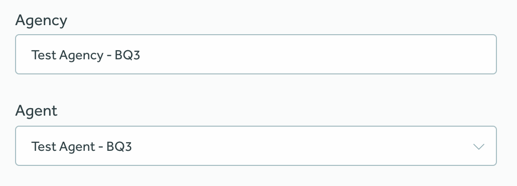
The select inputs for both fields are searchable:
Row
This component is used to create a layout with Rows and Columns. It allows us to place components in the directions of our choice.
Currently only Footer Toolbar supports rows.
Properties
type: the component type, always set asrow.name: a reference name for the Row component.columns: a list of Column components. A Row can have any number of columns.
Column
This component represents a column inside the Row component. It allows aligning any child component inside the layout.
It can only be used inside the Row component’s columns property.
Properties
name: a reference name for the Row component.align: Alignment direction of the column. Possible values areleft,centerandright.component: a generic component to render in the column or a Plugin Slot component. E.g. Continue Button, Submit Quote Button etc.
Example
type: row
name: footerRow
columns:
  - name: continueBtn
    align: left
    component:
      type: continueButton
  - name: backBtn
    align: left
    component:
      type: backButton
  - name: submitBtn
    align: center
    component:
      type: submitQuoteButton
      label: Submit
  - name: pluginSlotCol
    align: right
    component:
      type: pluginSlot
      slotName: britequote:footer
      slotType: button-row
The above configuration will render this layout:

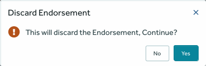
Discard Endorsement Button
The Discard Endorsement Button component is a simple component which renders an action button that is responsible for discarding an unbound endorsement.
Properties
type: the component type, always set asdiscardEndorsementButton.label: (Optional) a human-readable label for the discard endorsement button.confirmDialog: (Optional) an object to customize the confirmation dialog that appears when the user clicks on the discard endorsement button.title: (Optional) a title to be displayed on top of confirmation dialog.text: (Optional) the text to be displayed on the confirmation dialog.confirmButtonLabel: (Optional) a human-readable label for the confirm button.cancelButtonLabel: (Optional) a human-readable label for the cancel button.
discardSuccessMessage: (Optional) a text message to be shown confirming the endorsement has been discarded.
Example
type: discardEndorsementButton
label: Discard Endorsement
confirmDialog:
    title: Discard Endorsement
    text: This will discard the Endorsement, Continue?
    confirmButtonLabel: "Yes"
    cancelButtonLabel: "No"
discardSuccessMessage: Endorsement discarded
The above configuration represents the default values for all optional values and will render this layout:
For the button:

For the confirmation dialog:
For the discard success message:

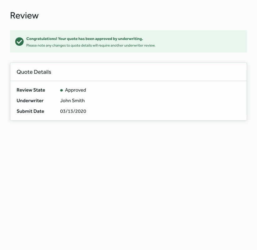
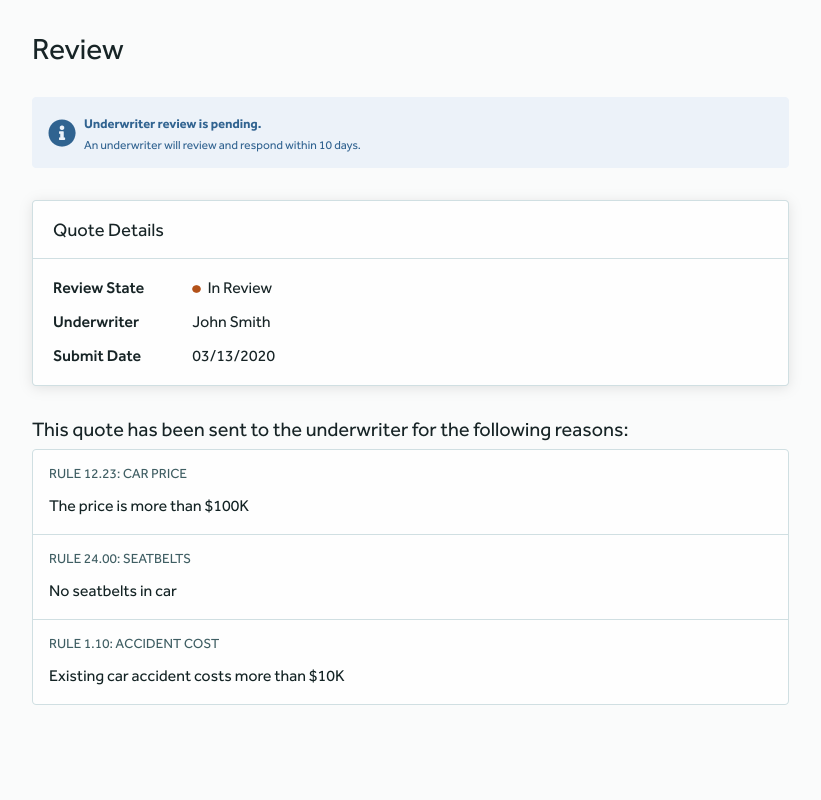
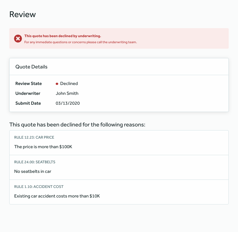
Review Panel
This component is used to provide feedback to the user once the quote has been declined, referred or approved by the underwriter.
Properties
type: the component type, always set asreviewPanel.name: a reference name for the Review Panel component.labels: (Optional) an object to customize the labels for the alert that is rendered in the Review Panel component based on the current review state.approved: (Optional) customize thetitle&subtitleof the alert that is rendered once the quote has been approved by underwriting.title: (Optional) a human-readable alert title.subtitle: (Optional) a human-readable alert subtitle.
referred: (Optional) customize thetitle&subtitleof the alert that is rendered once the quote has been referred to an underwriter.title: (Optional) a human-readable alert title.subtitle: (Optional) a human-readable alert subtitle.
declined: (Optional) customize thetitle&subtitleof the alert that is rendered once the quote has been declined by the underwriter.title: (Optional) a human-readable alert title.subtitle: (Optional) a human-readable alert subtitle.
Example
components:
  - type: reviewPanel
    name: reviewPanel
    labels:
      approved:
        title: Congratulations! Your quote has been approved by underwriting.
        subtitle: Please note any changes to quote details will require another underwriter review.
      referred:
        title: Underwriter review is pending.
        subtitle: An underwriter will review and respond within 10 days.
      declined:
        title: This quote has been declined by underwriting.
        subtitle: For any immediate questions or concerns please call the underwriting team.
The YAML above would be rendered like this by the UI when the quote has been approved by the underwriter:
When the quote has been referred to an underwriter:
When the quote has been declined by underwriting:
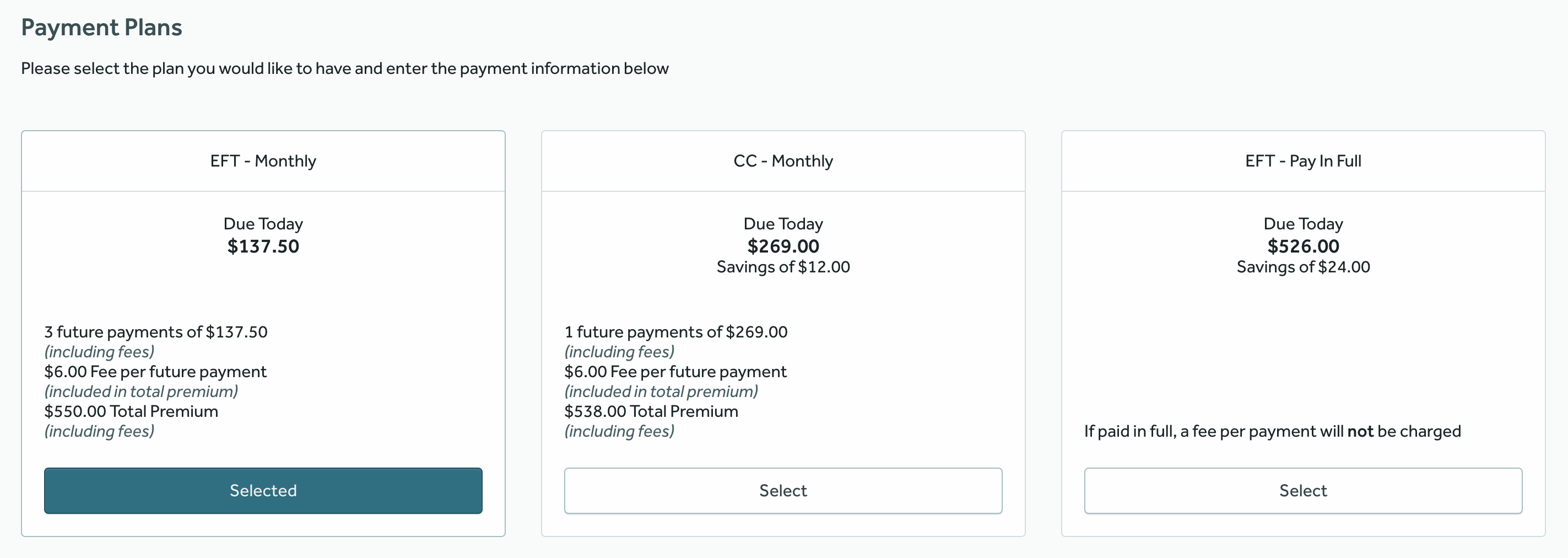
Payment Plans Display
This component is used to display different payment plans for the agents. Configure the payment plans in BriteQuote Django Admin by following this documentation.
Properties
type: the component type, always set aspaymentPlansDisplay.name: a reference name for the Payment Plans Display component.
Example
- type: paymentPlansDisplay
  name: paymentPlansDisplay
The YAML above would be rendered like this by the UI:
Notes
- The payment methods in the Billing Panel will be restricted to the ones allowed in the selected payment plan.
Billing Panel
This component is used to collect billing information. Currently, only the recurring payment type is supported.
Properties
type: the component type, always set asbillingPanel.name: a reference name for the Billing Panel component.paymentMethods: (Optional) a mapping to customize the payment methods label on the component.
Example
components:
  - type: billingPanel
    name: billingPanel
    paymentMethods:
      CC:
        label: Credit Card
      manual_pay:
        label: Manual Pay
      ACH:
        label: EFT
The YAML above would be rendered like this by the UI:
Setup requirements
There are two additional requirements to start using the Billing Panel in a Quote Flow:
- The
billing_schedulestable must be populated. - The BriteCore Contacts Integration must be set up. In production environments, it should be setup already.
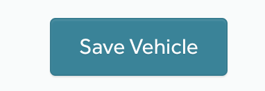
Save Risk Button
This component is used to render a button that saves the risk being edited. Currently, its only supported inside the Footer Toolbar for Risk Edit component. If the quote is locked, a Back button is rendered instead of the Save Button.
Properties
type: the component type, always set assaveRiskButton.label: (Optional) a human readable label for the button that overrides the default value.
Example
component:
  type: saveRiskButton
  label: Save Vehicle
The YAML above would be rendered like this by the UI:
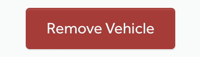
Remove Risk Button
This component is used to render a button that deletes the risk being edited. Currently, its only supported inside the Footer Toolbar for Risk Edit component. If the risk is not saved, a Cancel button is rendered instead of the Remove Risk Button.
Properties
type: the component type, always set asremoveRiskButton.label: (Optional) a human readable label for the button that overrides the default value.
Example
component:
  type: removeRiskButton
  label: Remove Vehicle
The YAML above would be rendered like this by the UI:
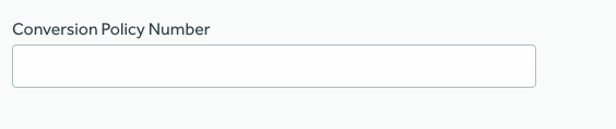
Conversion Policy Number Input
This component should be used in a quote flow for creating Conversion Policies, allowing for adding the Policy Number that should be used when the quote is bound into a policy.
Properties
type: the component type, always set asconversionPolicyNumberInput.label: (Optional) a human-readable label for the component.showComponentFieldName: the reference name of the field from thepolicyRisk Type in BriteLines that controls whether this component should be visible or not.
Example
- type: conversionPolicyNumberInput
  label: Conversion Policy Number
  showComponentFieldName: conversionPolicy
The YAML above would be rendered like this by the UI:
Defining a custom Quote Flow
A custom Quote Flow can be defined in a YAML file that must follow a specific schema.
The rest of this section will outline the steps needed in order to define a custom Quote Flow.
1. Define your steps
First of all, we have to think about which steps does our Quoting wizard require and then define a Page Group for each step.
Let’s say that all we need for our Quoting wizard are two steps: setup and review.
This is how our YAML would look like:
version: '1.0'
pageGroups:
  - title: Setup
    name: setup
  - title: Review
    name: review
Warning: the above YAML file wouldn’t work, because the schema requires at least one Page per Page Group. Hold on, as we’ll iterate over it in the next sections.
2. Define the pages
Each of the page groups defined in the last step may contain several pages.
Let’s say that all we need is:
- Two pages for the first page group:
underwritingQuestionsandpersonalInfo. - A single page for the second page group:
confirmation.
version: '1.0'
pageGroups:
  - title: Setup
    name: setup
    pages:
      - title: Underwriting Questions
        name: underwritingQuestions
      - title: Personal Information
        name: personalInfo
  - title: Review
    name: review
    pages:
      - title: Confirmation
        name: confirmation
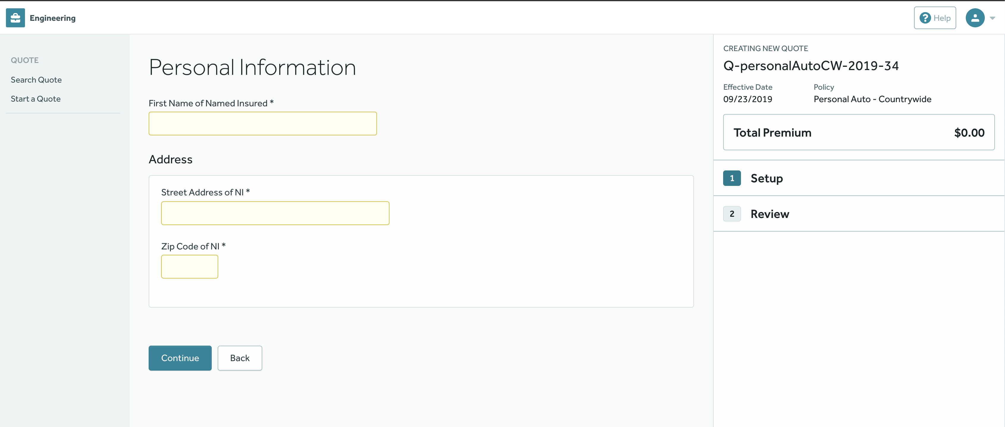
3. Define the forms for data collection
Now, we have to decide which fields we are going to place in each page. Let’s
focus on the personalInfo page defined in the step above.
Let’s say that we want to collect data for these fields in that page:
- First name:
firstNameNI - Gender:
genderNI - Street Address:
streetAddressNI - Zip code:
zipCodeNI
(Each fields reference name can be found in BriteLines, in the Risk Type you
would like to collect data for. The fields above are all related to the policy
Risk Type).
Once we defined the fields that we need, it’s just a matter of placing a
risk edit component pointing to the policy Risk Type and
include a few field groups with the fields we need.
Here’s the YAML file including the fields above in two separate field groups, one for the personal information and the other for the address.
version: '1.0'
pageGroups:
  - title: Setup
    name: setup
    pages:
      - title: Underwriting Questions
        name: underwritingQuestions
      - title: Personal Information
        name: personalInfo
        components:
          - type: riskEdit
            riskType: policy
            fieldGroups:
              - name: Name Group
                fields:
                  - name: firstNameNI
                  - name: genderNI
              - name: Address Group
                title: Address
                displayType: el-card
                fields:
                  - name: streetAddressNI
                  - name: zipCodeNI
                    widget:
                      size: xs
  - title: Review
    name: review
    pages:
      - title: Confirmation
        name: confirmation
The YAML above is rendered like this by the UI:
If you want to include further components such as risk tables into your flow, please refer to the Risk Table section on this document.
Quote Flow Search Criteria
We can create as many QuoteFlow objects as we need. For example, we might want to
have a given flow for quotes on the personalAuto line of business and a totally
different one for homeowners.
When we load a quote using Quote Flow, the system is going to perform a search on the current Quote Flow objects to find which flow should be used for that quote.
The search is done by checking the Criteria defined for each of the of the
QuoteFlow objects. The QuoteFlow whose criteria matches the current quote
will be returned.
A Criteria is nothing but a JSON object that looks like this:
{
  "version": "x.y",
  "criteria": {}
}
So far, there’s only one kind of Criteria supported, but additional versions will be supported in the future.
Note: backend code changes are required for each new criteria version we may add in the future.
Criteria v0.1
Quote Flows defined with this type of criteria will be selected for a given Quote and user based on these three properties:
- Product name.
- Transaction type (optional).
- Current user’s role (optional).
- Product versions list (optional).
The search for Quote Flows that use this type of criteria will return the first
QuoteFlow to have in its criteria:
- A product name that matches the Quote’s product name.
- A transaction type that matches the Quote’s transaction type (if defined).
- A user role that matches the current user’s role (if defined).
- A product version that matches the Quote’s product version. Important to be sure the correct quote flow is used when the version criteria is used, be sure to add it to every criteria related to that product.
Check out this example:
{
  "version": "0.1",
  "criteria": {
    "product": ["personalAutoNY", "personalAuto"],
    "version": ["af1304de-1110-4176-87c5-03ceeb1c25be"],
    "transaction": ["new_business"],
    "role": ["Agent", "Agency"]
  }
}
Let’s say we’ve attached the criteria above to a new QuoteFlow object that we’re creating. Now, if an Agent tries
creating a new Quote for the personalAuto product version af1304de-1110-4176-87c5-03ceeb1c25be, this new flow is
going to be returned, as long as it’s the first one having personalAuto in criteria.product,
af1304de-1110-4176-87c5-03ceeb1c25be in criteria.version, new_business in criteria.transaction and Agent in
criteria.role.
The YAML Format
YAML is a popular file format for software configuration and is currently supported by Quote Flow for custom Quoting wizards definition. If you’re not familiar with YAML, check out these links:
Observation
One possible caveat while creating the quote flow YAML file that can generate unexpected results is how it deals with some values, in some cases, textual values are treated as booleans by the system so values like “y/n”, “true”/”false”, “yes”/”no” or “on”/”off”, regardless of capitalization should appear in quotes to avoid this behavior.
Instead of:
- type: example
  label: Yes
They should be used as:
- type: example
  label: "Yes"
This way the value will be treated as expected.
Loading a Quote Flow
Once we’re done defining our Flow Configuration and the Criteria, now it’s time to use them in BriteQuote.
Loading QuoteFlow from Django Admin
- Go to the site admin page and click on “Add Quote Flow”.
- Add the Configuration YAML in the configuration field.
- Add the Criteria to define for which quotes this Quote Flow will be used.
The QuoteFlow Admin page looks like this:
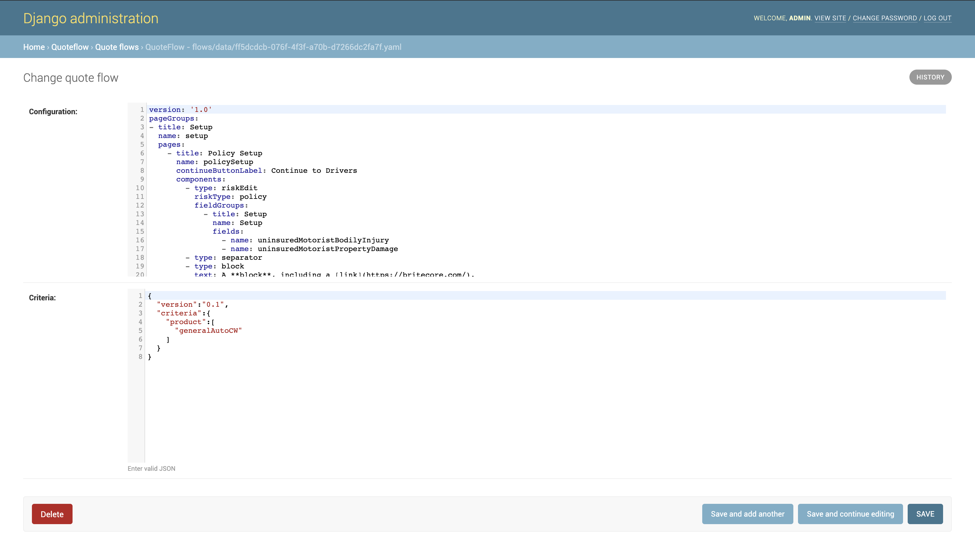
The same interface can be used for making further changes to the QuoteFlow configuration.
Now, go to your BriteQuote UI and create a Quote.
The YAML editor
The YAML editor available in Django admin supports a few shortcuts to make navigation easier:
Cmd-F/Ctrl-F: Start searching.Cmd-G/Ctrl-G: Find next.Shift-Cmd-G/Shift-Ctrl-G: Find previous.Cmd-Option-F/Shift-Ctrl-F: Replace.Shift-Cmd-Option-F/Shift-Ctrl-R: Replace all.Alt-P: Open persistent search dialog.Alt-G: Jump to line.